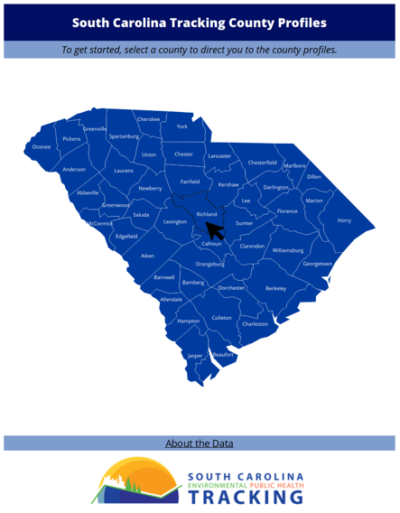
The South Carolina Department of Public Health has developed an interactive County Profiles Dashboard. The dashboard includes interactive data pages that allow you to view data that’s specific to each county.
Using the Filters
To filter this dashboard, select a county to be directed to the county profiles. A black outline will highlight the county’s border and click on that selected county to be directed.

Interpreting the Icons
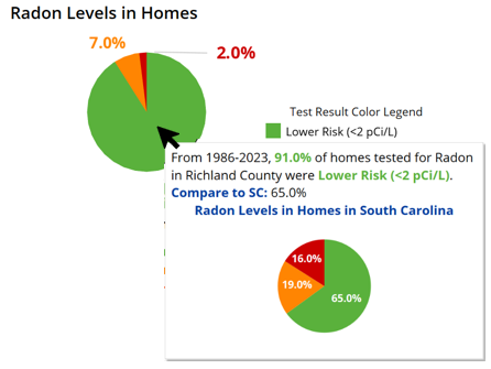
There are sections in the dashboard that compare the county’s data to state-level data. These headings read “Compare to South Carolina” and have two icons shown based on the county’s value compared to the state. Hover over the icon to see how the selected county’s data compares to the state value.


Tooltips
To view additional information about a graphic, hover over the graphic with your cursor and additional information, if available, will appear in a pop-up box.

Navigating to Additional Information
To return to the main dashboard page, you can click the arrow on the right side of the header.

To learn more about the dashboard you can click on the “About the Data” text on the bottom of the home page. This link will direct you to the “About the Data” file that contains all data sources used in the County Profiles dashboard, information on the data sources, and interpretations of the symbols used in the dashboard.
![]()

