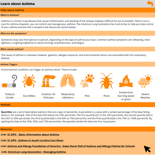
The South Carolina Department of Public Health has developed an interactive Asthma Dashboard. The dashboard includes interactive data pages that allow you to view data that’s specific to each county.
Using the Filters
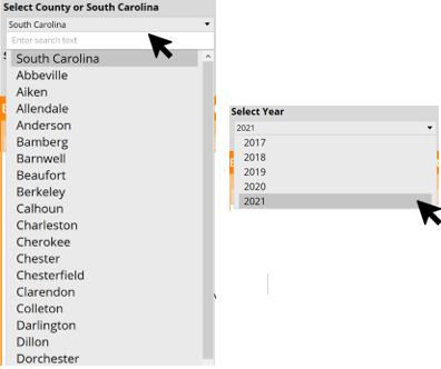
In the header of the dashboard, there are two filters: Select County or South Carolina and Select Year. These filters can be used to view the county and time-period of your choosing.
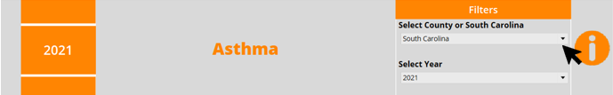
Click the drop-down arrow on each filter to view the options available for use on the dashboard. The graphics below will update based on the options selected. In the Select County or South Carolina filter, South Carolina will be listed alphabetically among the Counties. You must scroll down to select South Carolina.
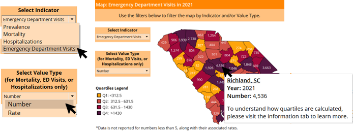
Using the Map
To view county-specific data, hover your cursor over the county you want to view on the state map. A black outline will highlight the county’s border and show additional information about the selected county. Click the drop-down arrow on each filter to view the options available for use on the map. The graphics below will update based on the options selected.
Tooltips
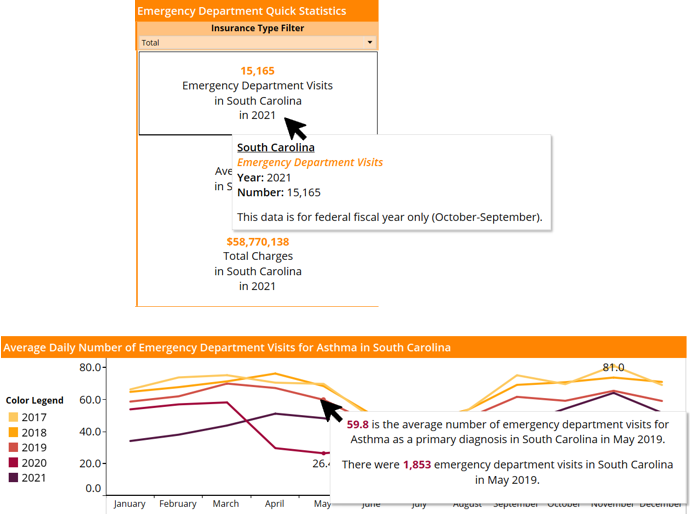
To view additional information about a graphic, hover over the graphic with your cursor and additional information, if available, will appear in a pop-up box.
To learn more about the dashboard you can click on the “I” icon on the right of the header. This icon will direct you to the information page.

On the information page, you can select URLs that will redirect you to websites that provide more information about the topics discussed on the dashboard.
To return to the main dashboard page, you can click the arrow on the right side of the header.
